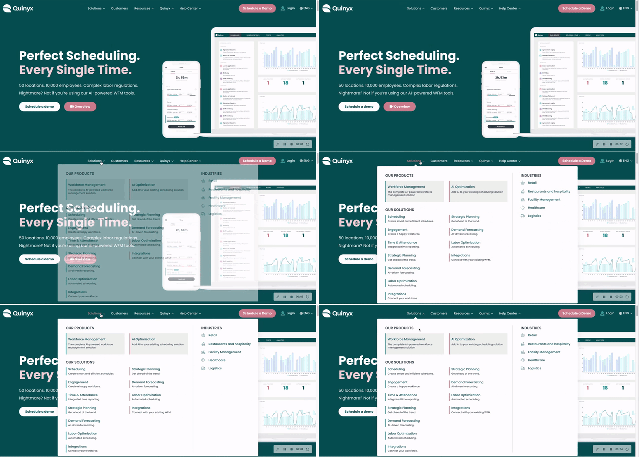
If you're looking for ways to improve your business website your navigation menu could be the right place to start. Menus are central to the user experience (UX) of your website and affect traffic, bounce rates, session length and conversions. Take a look at how we redesigned Quinyx’s mega menu navigation to be functional and stand out for their visitors.

First, what makes a great website menu?
Your menu is one of the most important parts of your business website. The menu helps your customers navigate to the items they're looking for, so it's crucial to have it organized properly. Your customers need to be able to find the product or solution they're looking for within a maximum of three clicks, and navigation UX is an enormous help in doing this.
Of course, a menu can be attractive as well as functional, and there's no reason any part of your website should be boring. In fact, your menu provides a unique design opportunity that can help your visitors and make your brand more enticing.
What is a mega menu?
A mega menu is a type of navigation menu that shows the most important elements of your website structure in a neat easy-to-follow package. It shows all the options you have available to your visitor organized into contextual sections.
This type of navigation is a horizontal or vertical drop-down accordion menu that is normally activated when users click or hover over the category with their cursor. Accordion menus eliminate scrolling navigation and give your users quick access to all the information on your website no matter how deep the pages are located. Mega menus keep the entire structure of the information visible and quickly accessible. They usually have expandable multiple levels and are useful if you have a large website with a significant amount of content or product categories.
Using a mega menu will certainly benefit your user experience and make their navigation smooth, well- structured and intuitive on your website.
Why Quinyx needed a menu redesign
Quinyx had an exciting growth opportunity to extend their product offering to add AI optimization to their existing scheduling solutions. A great new offering for their customers meant more solutions options making a traditional drop-down menu difficult to read.
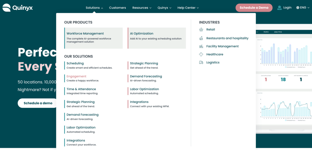
We were challenged to create clear groupings of Quinyx’s solutions offerings while visually illustrating which solutions fit with which product category. Some of their solutions fit under both their key product categories:
- Workforce management
- AI optimization
What makes Quinyx’s new navigation design successful?
The overall website navigation is fairly simple with a fixed header running along the top of the page.
We made sure that the mega menu design follows the Web Content Accessibility Guidelines (WCAG) and is accessible to all Quinyx end users. The menu opens when a user mouses over the menu options to avoid complex keyboard interactions.
With this navigation Quinyx website visitors can filter the category content through the mega menu with one click by indicating if they are looking for Workforce Management or AI Optimization solution. When the user clicks on a solution they will be directed to the appropriate landing page and not miss out on any content.
Our design creates clear and logical groupings within the menu and has prominent labels that visitors can easily scan. And the use of two juxtaposing colors and white space between groups creates a visual separation between the categories to reduce the amount of work someone has to put in scanning the list of items.
We're very happy with our new mega menu. iGomoon has made it much easier for our visitors to scan our solutions offerings which helps them to achieve their goal on our website. I'm pleased with their professional delivery and enjoyed working with the team on this project."
- Mark Phillips, Digital Marketing Director at Quinyx
Why navigation design is so important
Whether it’s as a vertical sidebar navigation menu, a drop-down or tabs, every product needs to have a user flow that a person can navigate to achieve their goals.
Without well thought out navigation, your user may have trouble finding or using your product and even abandon your website. The reason that navigation design is so important is that it is a method by which your user can explore and enjoy your product and business offering.
If you would like to implement a similar mega-menu solution on your business website, get in touch with our crew.
