How to break through the code base clutter for a better user experience

Bio-works
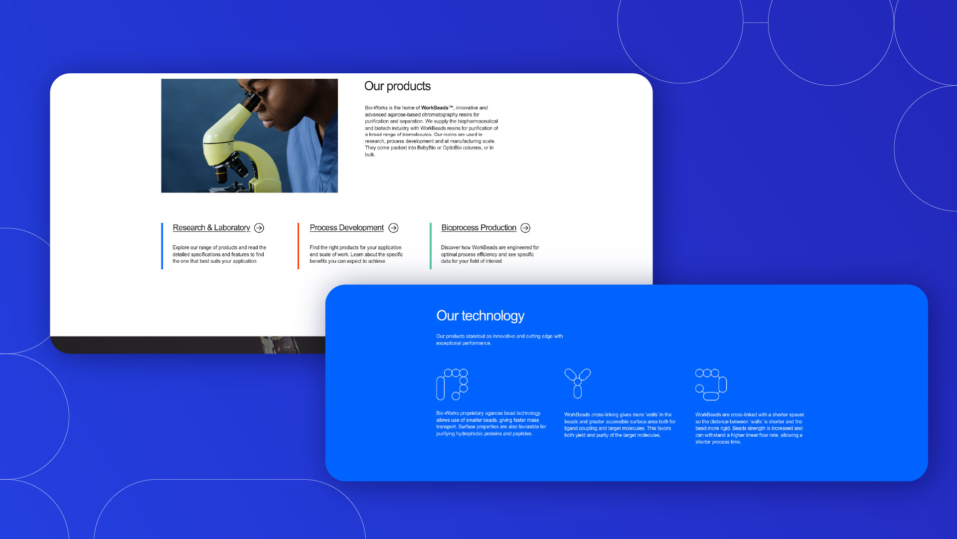
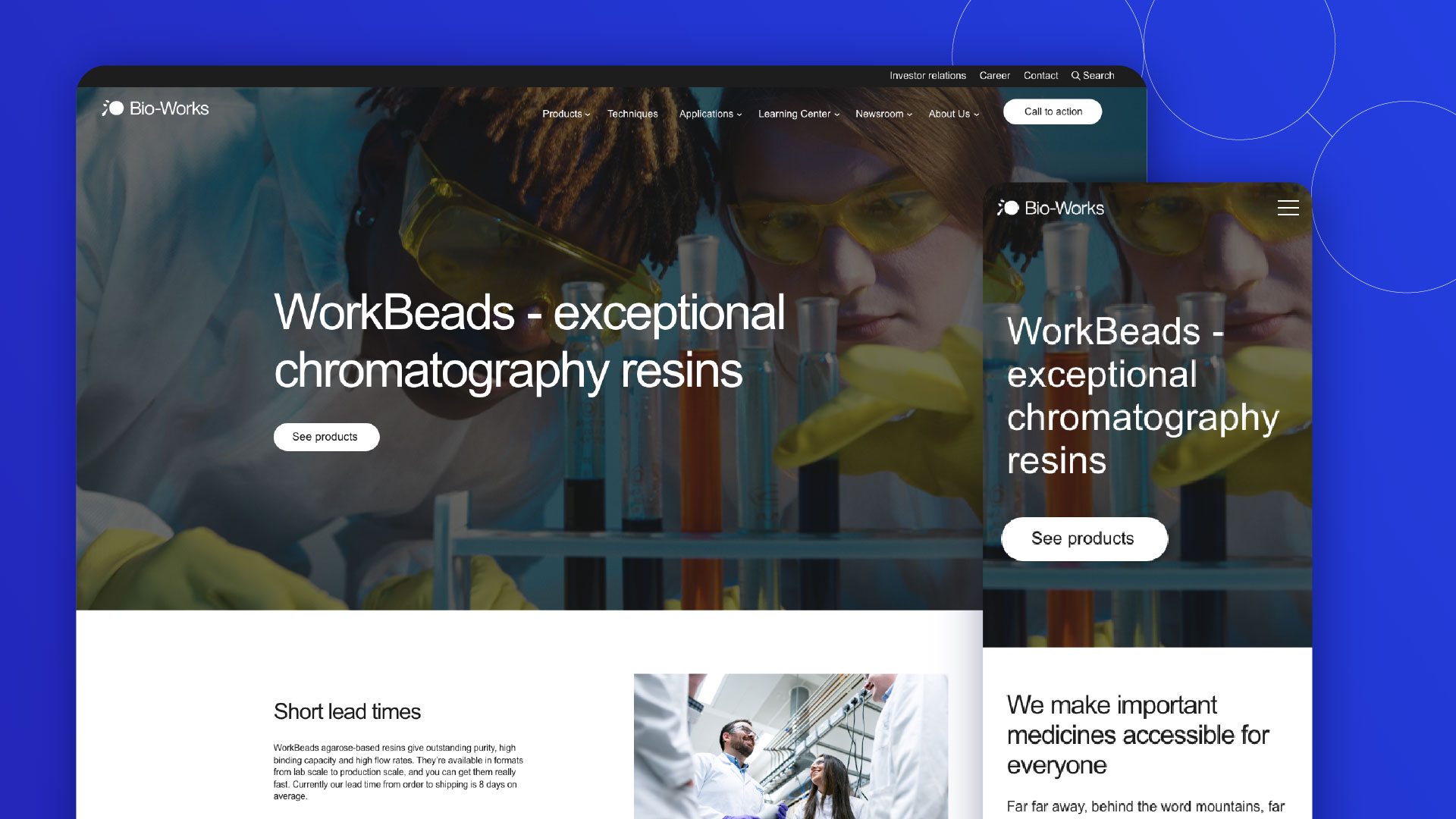
iGoMoon's goal was to create a better user experience so that the Bio-Works team would have a far simpler time updating their business website. We also wanted to ensure their streamlined modules would be in alignment with their new brand guidelines and ensure their website was consistent.
Our delivery
The problem
Bio-works had an existing code base of more templates than they needed and a lot of modules. There were so many modules that were not being used or didn’t work properly, and it was making it difficult to make changes to the business website. Bio-Works team members who work on the site needed a streamlined way to make changes to the website. They had also changed their brand look and feel which we needed to incorporate throughout the new modules to create consistency on their website.
The solution
Our developer team reduced the number of templates and the number of modules to only the ones that were needed, three. The modules we created are more flexible in terms of design which means the Bio-Works team can easily change the layout, background color etc. as they need to. This gives them a streamlined user experience that’s easier to manage and work in.
Rhiannon Sanders, Senior Marketing Manager at Bio-worksiGoMoon have beaten everybody. We introduced a new brand at the same time as we built and rebuilt the site technically and got everything working. So we did quite a lot together and all at the same time. Top marks, thank you.
The result
Only a month after launch, the bounce rate for the website took a significant dive in the right direction, and bounce rate was down by 14%.
You can read more about Bio-works' website project and the strategies Rhiannon Sanders, Senior Marketing Manager, at Bio-works uses to accelerate their growth in this exclusive Q&A interview.

