Transforming Dialogtrail’s brand with a new style guide and illustrations
Dialogtrail
Our goal was to attract new users to their website and encourage them to try their platform. We want to help Dialogtrail stand out from their competitors by creating a brand signalling the adjectives of; playful, cool, modern, and premium.
Our delivery
The problem
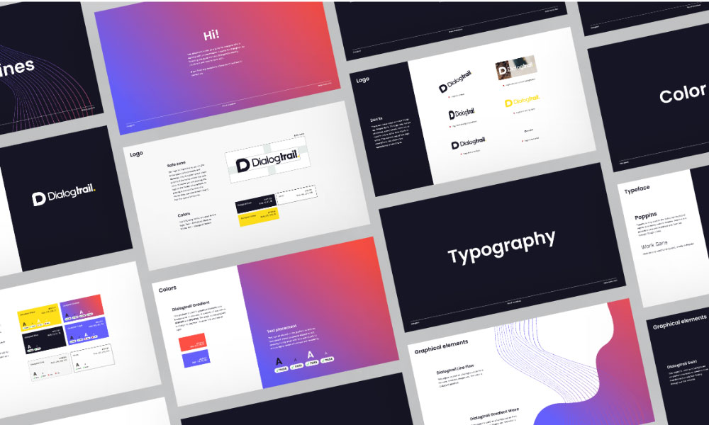
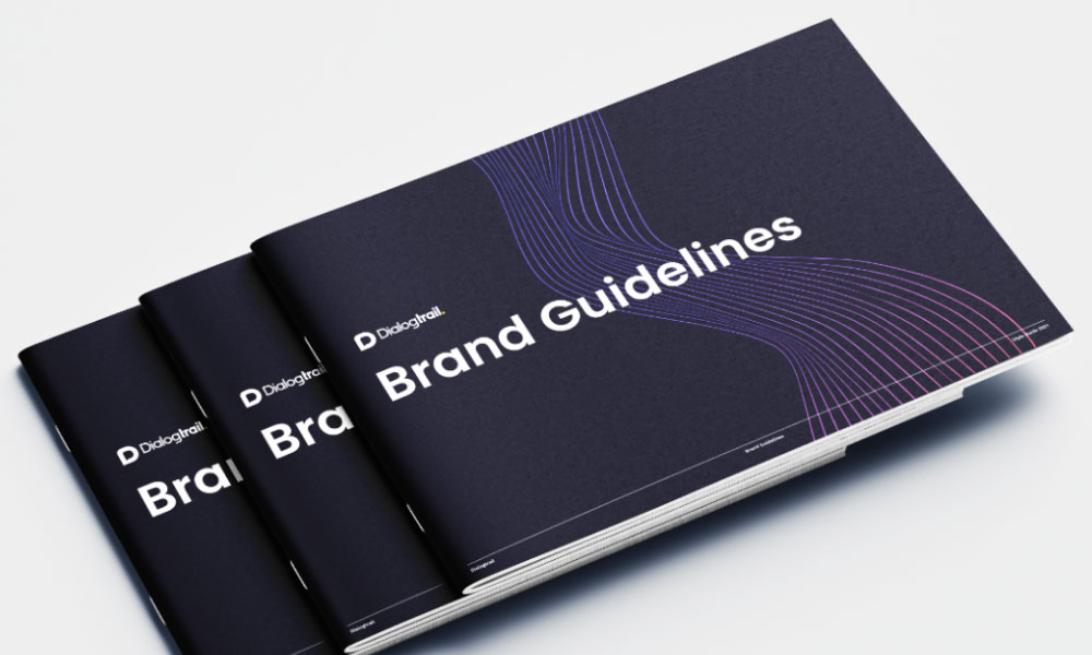
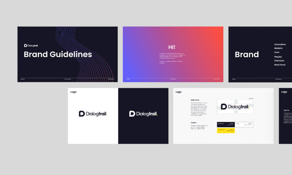
Dialogtrail did not have a brand style guide which is a key document to ensure they communicate consistent visuals and messaging to their audience.
Dialogtrail needed a new and updated look for their brand. Their biggest challenge was that their customers had difficulty understanding their product and the value it could provide them. Dialogtrail’s product is highly innovative in the market, so we set out to make their brand reflect this
The solution
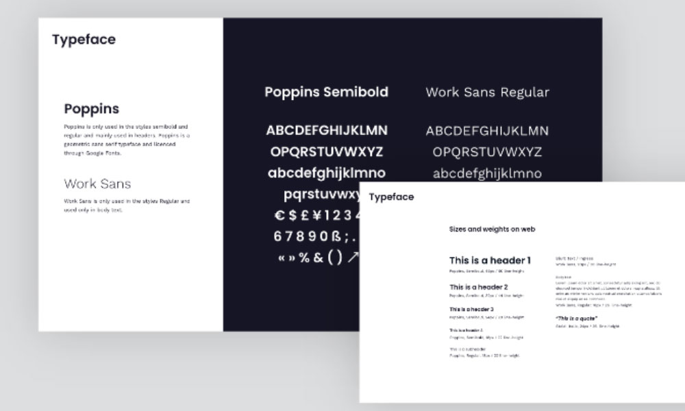
iGoMoon helped Dialogtrail take their brand to the next level and ensure they maintain visual consistency by documenting their brand’s style guidelines.
Dialogtrail wanted to keep their yellow color and logo, since they’d already built brand recognition around these elements. We created a new visual identity with additional colors, typography, illustrations, icons and other brand elements.
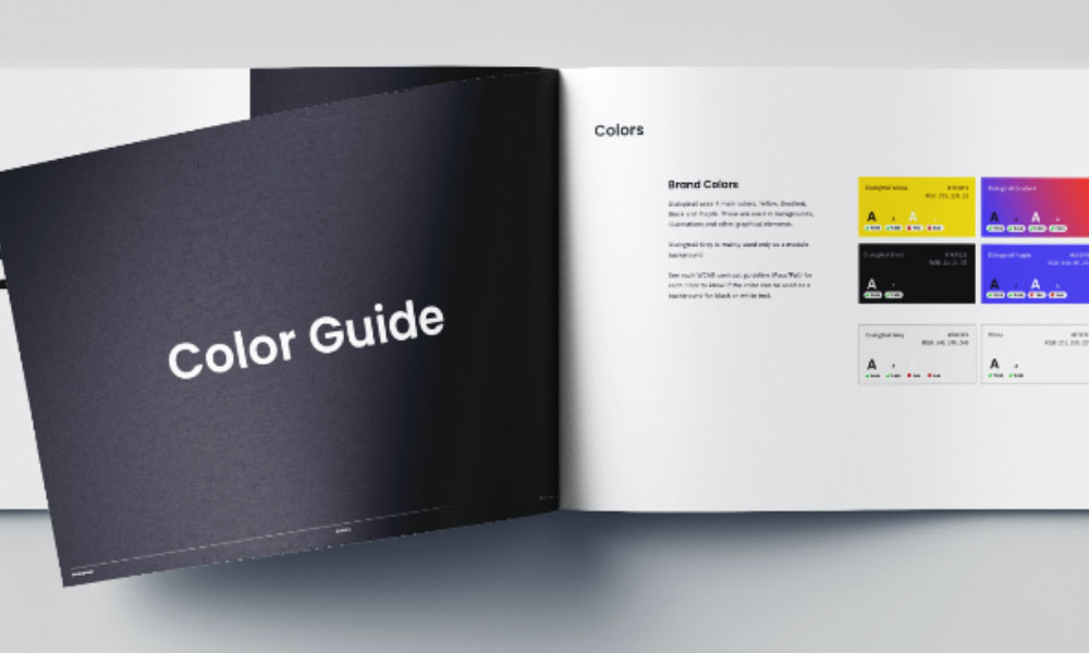
Brand Colors
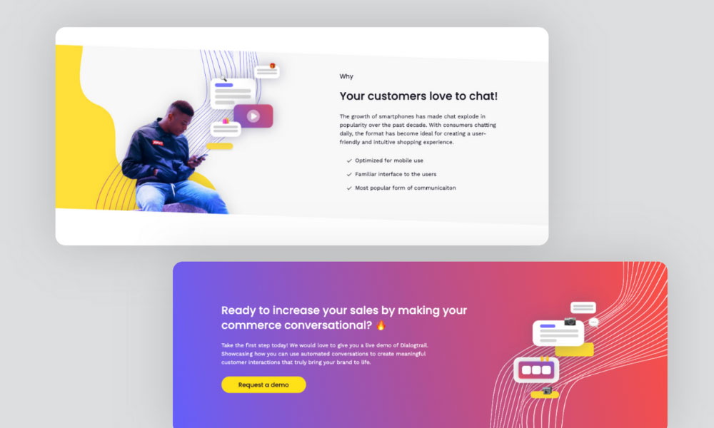
Building on the brand keywords, we created a new color palette with a gradient in pink and purple to complement Dialogtrail’s statement yellow. We did this to create a tech savvy look and anchor it to the new stated brand adjectives of innovative, modern, cool, playful, premium and must-have.
Illustrations
To create a timeless design, we decided to go with a more abstract approach, illustrating the core of the products which is a chat flow with conversational commerce. Instead of using detailed mockups and screenshots of the actual platform, the aim was to evoke feeling and explain the product in a fun and intuitive way.
The graphic elements combine people, illustrations and an abstract line flow which mimics a chat flow. This creates a unique look and brings out the essence and values of the Dialogtrail brand.
The Design Process
We worked closely in collaboration with Dialogtrail.
The style guide functioned as a stepping stone for Dialogtrail to redo their while website design/ When the brand was set, it was time to redesign the look of their website.
The result
A new exciting brand identity that highlights the adjectives of; playful, cool, modern, and premium.
