Building a top-performing website with Growth-Driven Design
Having a website that looks attractive and effectively provides useful information to your visitors is the best way to stand out and deliver a unique customer experience. However, building a website can be frustrating. The way to turn negative feelings into a positive experience for your team and business is by using the Growth-Driven Design methodology when redesigning your website. Below we will explain what it is, how it works and answer all questions related to effective website redesign, share instructions, tips, and successful cases.
#1 Traditional web design vs. Growth-Driven Design
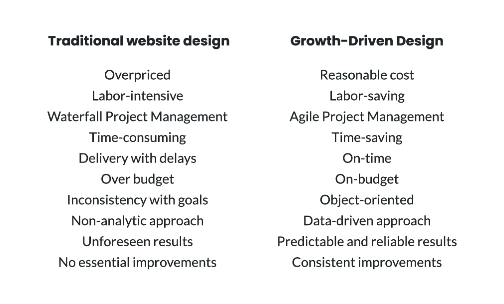
The approach to creating and developing websites is essentially flawed. First of all, traditional web design is time-consuming and risky. The project typically exceeds its budget and timeline, in addition to having a high starting cost and requiring a large amount of time, energy, and resources. It's not always clear how much the website will impact the company's bottom line. But worse, substantial improvements such as ongoing optimization and the creation of important website components that generate business value are typically overlooked.
According to Growth-Driven Design (GDD) founder and HubSpot Lead Luke Summerfield, there’s been a huge shift in web design in recent years, primarily because fast-growing companies have changed the way they look at a website. This led to the need to modify the methodology for creating and redesigning websites to increase efficiency. This is how Growth-Driven Design was born.
Growth-Driven Design is the ultimate methodology for web design that helps to create and optimize high-performing websites. The methodology is based on a three-step approach that allows launching a website four times faster than with traditional web design and ensures continuous improvement. Growth-Driven Design adds value to users and boosts company development.
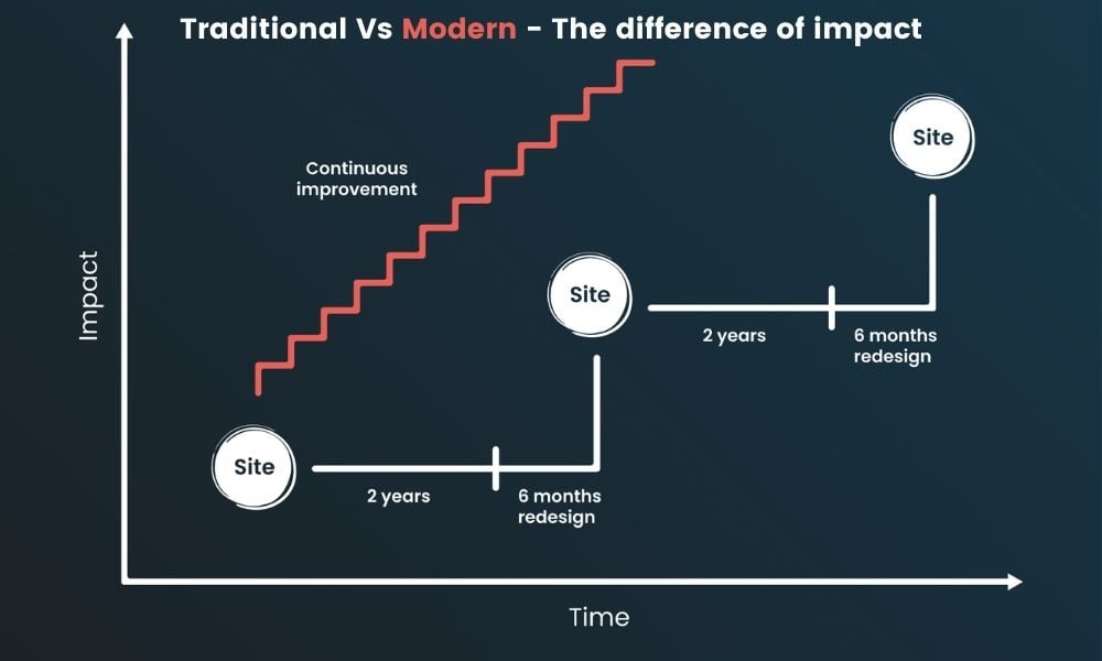
Using actual data and continual learning this methodology reduces the time to launch. But it also aimed to continually improve the performance of the website even after the launch phase. Almost 50% of marketers admit that they make impactful improvements to their website, not more than once a year which is absolutely negligible. Many follow the “set-and-forget” attitude in traditional web design but such an approach doesn't work well. After all, your site is the most important marketing asset of your company. Thus Growth-Driven Design becomes a long-term investment that yields steady monthly extension. Your website will expand and become stronger as you continue to measure, iterate, and act.
To build or redesign your website you need a solid team, a substantial budget, and, of course, time and a detailed description of each step in the timeline. The Growth-Driven Design methodology combines Lean and Agile principles into a successful data-driven web design process. Sharing learnings with other departments and aiding users in accomplishing their goals through the website helps your entire business. The building and administration of websites using Growth-Driven Design eliminate the risks associated with traditional web design.
#2 Three stages in Growth-Driven Design
The Growth-Driven Design approach consists of three major stages: website strategy, launch pad, and continuous improvement. The strategy phase begins with planning and research and ends with the construction of a wishlist. This wishlist becomes a foundation for the launch pad phase which means that you're constructing a website that looks and performs better than what you have now, but it's only a starting point for your future successful website. Next, follows the continuous improvement stage. Let's take a closer look at each stage.
Website strategy
As in any business, the first step is always to settle a plan of action. The goal of the strategy stage is to figure out who your audience is and how the website can help them solve problems along the way. Investing in strategy will help you to create not just a good-looking and functional website but also one that has a close connection with your visitors and builds relationships. This stage includes seven steps:
- Set SMART goals
- Identify your audience needs (Job-to-be-Done)
- Develop buyer personas
- Define fundamental assumptions
- Map customer journey
- Develop a website-specific strategy
- Brainstorm a wishlist
Set SMART goals
Your website must be lined with business goals and metrics because this is the main tool for your business growth. To complete this, all stakeholders should be involved in the process to figure out what their goals are and how the website will help to achieve them. To correctly analyze the website's influence on the business, the goals should be SMART - specific, measurable, achievable, relevant, and timely.
There is a useful template for goal setting that is split into eight areas: the mission, strategy, plays, KPIs, target goals, stretch goals, actual results, and omissions. Let's define what is what.
The mission area should be in line with the company's overall objective. The second element - strategy - is the current year's goals, specifically with respect to the website, to come closer to the mission.
Each focus area is now broken down into two to four plays that the team may execute. Each play describes who must complete what, where, and when in order to achieve results in each focal area. An important pillar here is key performance indicators (KPIs) that quantify the impact you have on the business as a result of the plays and emphasis areas you've picked.
Each KPI should have a goal as well, targeted and stretched. Target goals can be your trailing three- or six-month performance of the particular KPI. They are realistically attainable and should be achieved by the end of the year. Stretch goals are more ambitious. They help to keep teams on their toes. Teams usually land somewhere between target and stretch goals.
Be sure to follow your actual results. That's why it is important to document the progress. But not less important to document what you should not work on - these are “omissions”. You and the team can define the areas you’re not going to pursue this year so there are no distractions in achieving the main goals.
It is crucial to revisit the compiled document at the midway point each year to see that the team is on track. Getting everyone on board and setting the right expectations using this document as a conversation starter will be key to the success of all planned activities as you begin.
Identify your audience needs with (Job-to-be-Done)
To fully comprehend your target audience, you'll need to do user experience (UX) research. To find user insights that will lead you through the rest of the strategy stage, you can conduct qualitative, quantitative, observational, or a mix of research methods.
At this phase, we recommend getting to know the Jobs-to-be-Done (JBTD) framework, developed by Anthony W. Ulwick. It explains the motivations and desired outcomes behind why people buy. The goal of the Jobs-to-be-Done theory is to understand what exactly your customers are trying to reach.
In other words, your customer is someone who is "hiring" your product or service to fulfill a certain task - the so-called "job". Once hired, your product or service must perform the task, resulting in the expected outcome and assisting the person in moving forward.
The format of a job story is as follows: As (who the person is), when I am (the situation that person finds themselves in), I want to (the motivation or action) so I can (the desired outcome).
This procedure comprises condensing your existing knowledge about your market, organization, and website. It reveals the causal motivation behind a purchase and alters our knowledge of customer choice. It's also crucial to start with the Job-to-be-Done because there are often several ways to achieve the same "job". These different paths can cross industries and go beyond what is generally thought of as competition.
Develop buyer personas
After determining what needs your product is necessary for the buyer, it is time to proceed to the description of its characteristics and create a Buyer Persona, a semi-fictional representation of your ideal customer. We do persona compilation exactly at this stage because the focus on knowing more about customers has taken organizations in the wrong direction. It doesn’t tell you how to create products and services that customers want to buy. Only the Jobs-to-be-Done theory that we describe previously does this.
Thus at this step, companies must define their customers, their problems, goals, and their demographic and psychographic characteristics. As Buyer Personas specify the particular categories of individuals in your target market, keep the notion separate from the Ideal Customer Profile, which broadly describes your target market. Our guide with recommendations, checklists, and examples can help to compose the best and most detailed Buyer Personas. Identifying them will help you to understand what role your website plays for them.
Define fundamental assumptions
This is the most challenging part of the process since it becomes a summary of all information gathered and analyzed so far. These basic aspects will be a common thread that runs across the whole business. Assumptions are called so here because they haven’t yet been proven to be true, yet they're critical to a successful website and marketing strategy. This list may be reviewed and adjusted after the website goes live and you start testing.
A certain sequence is important here, which we recommend everyone to follow at this stage. It would be best to start with stating the main task that needs to be completed, as well as the intended progress and goal that the person is trying to attain. Take a close look at who these individuals are. Then figure out what challenges they're having and try to solve them with solutions your organization can provide. Next, describe the circumstance that inspired them to consider using your product or service, as well as the unique value they will receive only by working with you. After that, you should connect all of these assumptions to the website.
Our advice here is to look at all the statements simpler because this worksheet will evolve over time.
Map customer journey
Knowing personas and why they need your product, can proceed teams to the stage of building a customer or buyer's journey - an active research process the customer goes through on the way to a purchase. It includes stages of Awareness, Consideration and Decision.
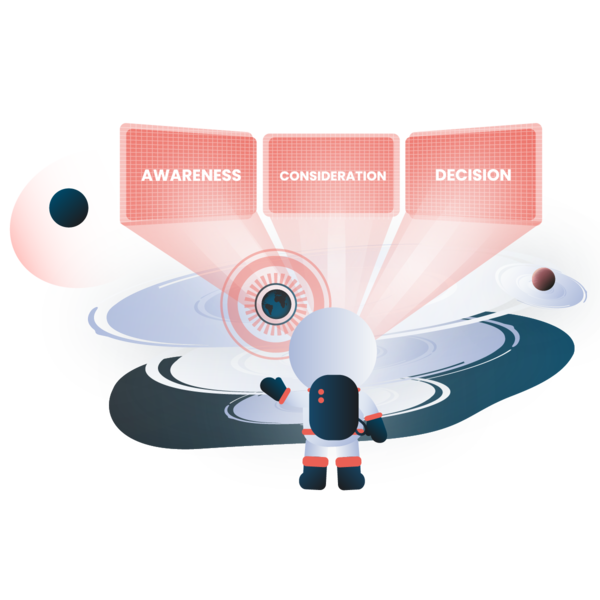
In the awareness stage, buyers become aware of their problems. In the consideration stage, they know exactly their problem and are looking for the solution. The buyers are considering different categories of solutions and trying to understand how they want to solve their problems. The decision stage comes after they’ve narrowed down the possible solutions to just a few options and are deciding on specific ones.
You'll have a better idea of how to tie your website into your persona's life and answer their concerns if you sketch out their journey.
Develop a website-specific strategy
This part is about applying all the gained knowledge directly to the website. The strategy should include auditing the existing website to see if it matches the data you've collected before, what works and what doesn't, and which elements are supposed to be in a new website. It is also important to understand how the website can be used so that all departments achieve their goals.
You may now build your new user flows using the acquired knowledge in the previous phases. A user flow is a step-by-step process that a user should follow to achieve a certain goal. This result should be connected to the customer journey that we discussed above.
The website-specific strategy includes work with elements such as website architecture, on-site SEO, key sections and pages, integrations, technical requirements, and more. You need to put on-table discussions around branding and visual design considerations. The brand board will come in handy here, so if you don’t have one, it's time to create.

It's important to focus on brand components such as colors, personalities, sentiments, emotions, and moods, which may have altered since your first website was initially launched. This will guarantee that everyone working on the website makeover is on the same page and that the brand is visible throughout the process, from design to texts and video.
But it is also important to keep in mind that this is not the final version and after following the brainstorming session with the team, the user flows, website architecture, and design will most likely need to be evaluated and revised once again.
Brainstorm a wishlist
What is a wishlist? Usually, a wishlist is an itemization of realistic things that a person desires. In building the website, the same thing happens, only this list is made up of all members of the organization.
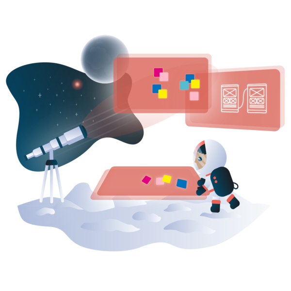
The wishlist will include innovative and compelling website concepts that attempt to address users' problems, provide value to their lives, and assist your company in achieving its objectives. The best result of this process is the creation of between 75 to 200 various ideas for the website, including site components, sections, pages, particular features and modules, and integrations. This strong wishlist of high-impact concepts will form the basis for the next stage of the Growth-Driven Design - the launch pad.
Launch pad
The idea of a launch pad is to rapidly create a website that is better looking and performing than what you have now, but it is not a finished project. Rather, your launch pad will serve as the basis upon which you build and optimize, and improve your business. This process usually takes between 60-and 90 days in GDD.
Is that even possible, you ask? Well, the answer lies in the approach. There are a few tactics to speed up the launch.
The first way is to work with an expert agency to guide the team with the optimal approach to a launch pad. Then you can run design sprints that may be used on high-impact pages and sections. The third way is to begin an organized content generation process as soon as feasible. The time allocated to creating important, high-quality material is often underestimated.
Investing in internal efficiency is the fourth point. That includes collaborating with your teams to design agile procedures, creating an internal library of pre-built templates, reducing developer dependencies so marketers could update the content on their own, and more.
A launch pad focuses on prioritized improvements to run websites sooner and get results faster.

Continuous improvement
After you've designed the strategy and launched your website, you can move on to the next stage - continuous improvement. It’s based on an agile process: plan, build, learn, and transfer, and assumes 14-day sprints. Working on impactful improvements is really crucial for your business.
To move toward the goals you should determine the most significant elements that you need to create or optimize. The first step is to choose a focus area. This step may be daunting, but a website performance roadmap, which is a framework that helps your team focus their time and efforts on the most important areas, is helpful here. It’s organized to correspond to a website's lifespan. There are three major themes in GDD: establish, optimize, and expand.
The establish theme focuses on the key foundational actions that may be done once you're creating something new. There are three emphasis areas under this theme: creating high-impact things that are simple and quick to complete, cultivating an audience to gather data and run experiments, and ensuring the website is providing value to visitors.
The optimize theme focuses on enhancing the user experience. To create a hyper-relevant experience, the three key areas here are increasing site usability, conversion rate optimization (CRO), and customization.
The expand theme focuses on adding features to the website in order to increase its overall effect.
As part of working in sprints, it is important to conduct user experience research. You should constantly look for problems that the user encounters on the website. This process in turn creates a new priority action plan for the sprints.
When the focus and action priorities are determined, you may advance to the second phase in the continuous improvement cycle: build. The build step's purpose is to organize sprints with a cross-functional team to finish all of the high-impact action items. This is when you can start with the experiments.
The third step is learning. It's crucial to evaluate the data and look at the results in order to have a better understanding of your target audience. You learn more about your audience the more you repeat the loop.
The transfer step is the fourth and last phase in the continuous improvement cycle. The goal is to share knowledge and exchange ideas throughout the company in order to improve the whole organization.
Watch the full talk by Luke Summerfield in the webinar on How to build a peak-performing website
#3 Tools you need to build a website
Having the right tools may lead to new opportunities, a better understanding of your users, more efficient teamwork, and a larger influence on your business.
Before you make a purchase, you often think about how it will solve your problem and how you'll use the product to achieve this. It's the same when choosing tools for building a website. The number of tools is not as important as the quality. First determine the goals and how this tool will help in the development of the website, what are functions required to solve all needs, and finally, which tools have the desired functionality.
Here is a list of tool types, so it’s easier to know which areas should be covered:
- Agile project management tools
- Content management system (CMS)
- Research and testing tools
Agile project management tools
To have efficient teamwork everyone needs to have a certain tool stack. We have tried multiple tools and found some that work best.
Trello - a free project management solution. Trello is a simple, customizable Kanban board for teams who want to work agile but don't follow the entire agile development ritual. But sometimes you need more functions.
ClickUp - an all-in-one tool to manage projects, people, and everything in between.
Google Workspace - is a suite of cloud computing, productivity, and collaboration tools, software, and solutions for businesses of all sizes. Google Workspace provides high secure productivity via communication apps or collaboration apps such as Google Docs, Sheets, Slides, and Forms.
Miro - a web-based collaborative whiteboard tool that allows distant teams to collaborate efficiently. Connecting Google and Miro gives your teams new methods to work visually from anywhere, as well as lightweight tools to improve meeting engagement and creativity. It works great for brainstorming ideas.
Slack - a business communication platform that links users and helps your team connect in a secure, fast, and organized way.
ContentStudio - content marketing and social media management platform. Instead of spreadsheets and disjointed workflows, ContentStudio provides all the tools you need to consolidate your content marketing operations.
Adobe XD - a vector-based user experience design tool for web apps and mobile apps.
Figma - a powerful prototyping tool for user-friendly presentation and tool kits. Figma will help your team create high-quality wireframes and interactive prototypes. Designers and developers may collaborate online to modify, comment on, and evaluate designs and code.
Content management system (CMS)
Despite how you're going to build your website, you'll need a content management system. Building and managing your site with a CMS can help you expand over time. There are many CMS available nowadays to meet a variety of needs.
When choosing a CMS, think about who will be involved in the website's creation, what features are crucial to your business, and what your budget is. Scalability, security, pricing, themes, integration possibilities, and content editors are all things to consider.
 HubSpot offers a fairly functional CMS system with many built-in tools that can be the right fit for your business. It’s in the top 10 CMS according to G2, the world's largest tech marketplace - so there is something to think about.
HubSpot CMS has a number of advantages and what is most important it includes a CRM which makes it even more powerful.
It's available in three editions based on features: Starter, Professional, and Enterprise. It includes features for security like premium hosting, content delivery network (CDN), standard SSL certificate, Web application firewall (WAF), tools for website building like themes with drag-and-drop editor, app and asset marketplace, and tools for personalization and reporting.
Thus, the HubSpot CMS is secure, bridges the gap between marketers and developers can help to improve your website performance in search engines, and allows business owners to easily access data about visitors.
Research and testing tools
Growth-Driven Design is a user-centric approach with real data at the epicenter. It's vital that you use the most relevant and full data and insights to identify user difficulties, prioritize action items, and solve their problems. User behavior should be examined and understood first, followed by the hypothesis generation based on the analysis and the creation of a proposed solution. As a result, both research and hypothesis-testing tools are required.
Here are some resources to assist in achieving both goals.
Hotjar - a behavior analytics software to discover, consolidate, and communicate user needs. The platform includes click and scroll heatmaps, user recordings, on-page questionnaires, and funnel reporting.
Google Analytics - service that tracks and reports website traffic.
HubSpot A/B testing tool - running split tests for email, landing pages, and CTAs directly in HubSpot software.
Typeform - online form building and online surveys, can also be used to develop simple web products and tools.
Mixpanel or Amplitude - can be both used for the analysis of user behavior and testing. Both systems look at what users have done, but the procedure and outcome are different. Mixpanel's Predict models seek which users are most likely to execute a given conversion activity. Amplitude uses its Personas to automatically group comparable users into behavioral cohorts.
BrowserStack - a testing platform with the ability to test websites and mobile apps across on-demand browsers, operating systems, and mobile devices.
UsabilityHub - a remote user research tool that validates design decisions with real users, removing the guesswork from the process.
Google Optimize is a great option to start with free tools to test the site’s content.
UserTesting - user testing platform on the market to improve your brand's UX.
To improve the website performance, SEO, and usability of the specific elements, we recommend a number of very useful tools such as PageSpeed, HubSpot Website Grader, Schema.org, SEO META in 1 CLICK, Funkify and WebAIM.
If you'd like a demo of HubSpot tools, contact us
Choosing the proper tools allows the team to achieve faster outcomes. You can acquire fresh insights into user behavior and view the whole picture. Your teams will have a better knowledge of which user's behavior is responsible for the company's success. As a result, building and optimizing the website to promote more of those behaviors will be easy. It will help your team more easily demonstrate the return on investment (ROI) your web design and optimization efforts are having.
Investing in an integrated tool stack can enable you to have a positive influence on all aspects of your organization, including sales, marketing, and customer service, eliminate bottlenecks and empower team members to take action.
#4 Trends in web design
Of course, the web design process doesn’t end with standard procedures. It’s always about following trends and changes in the world which provides a greater variety of issues to work with, allowing us to experiment with more things and come up with new ideas.
Web design is always a look into the future. Because of its technological connection, it becomes a showcase for new breakthroughs such as animation and interactivity every year.
In global trends we see that the style of the past decades is making a comeback, typography is becoming more prominent, live animation is reaching new heights, and visual styles range from high-tech to handmade. Did you know that 38% of people will leave a website if the content or layout is unattractive?
Images are taken to the next level with collages, abstractions, and textured grain gradients. But if you want to stand out, and complex collages, multicolor and interactive are not your forte, then pay attention to art deco motifs, oversized typography, split-screen layouts, grids, or linework.
On the flip side: the simpler the better works too. Minimalism, especially in forgoing images, seems to have become a classic of the genre. There is a movement towards a more gender-neutral look and feel.
Something fun in web design is web-based scavenger hunts. The layout of websites lends itself exceptionally well to the interactive. You may link sections or even websites together, forcing users to offer answers or solve riddles by creating an intriguing puzzle. This generates a unique customer experience, helps to attract visitors’ attention, and encourages them to follow the path you've laid out on the site.
See our customer cases for more inspiration
Just like that the Growth-Driven Design became a solution for creating a website that can be much easier, faster, and more efficient with the right approach.
